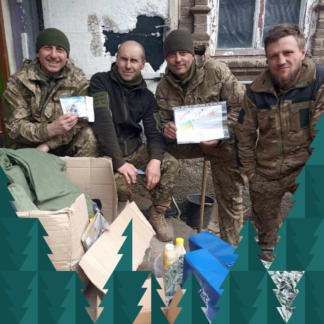
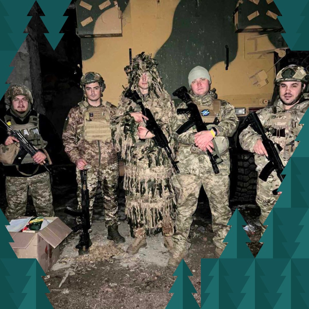
We are a volunteer organization that has been helping the military and civilians since the first days of the war. When the Chernihiv region was under occupation, almost completely mined and suffering from a humanitarian crisis, we baked bread, made cheese and delivered it to people in the occupied and cut-off villages and towns, transporting humanitarian aid from the state and international organizations. We ourselves were 7 kilometers away from the fighting, making our way through mines and shells. At the same time, we worked with the military, helping them with whatever they needed. When the Chernihiv region was liberated, we continued to volunteer and now help people in need in our small homeland. We have also organized supplies to the front line at the request of the soldiers. We now produce vitamin tea blends and dry food
What tasks we have been solving
We had to choose a name and a slogan for the new brand, and create a logo and corporate identity elements that would best represent the essence and values of the brand.
Our approach
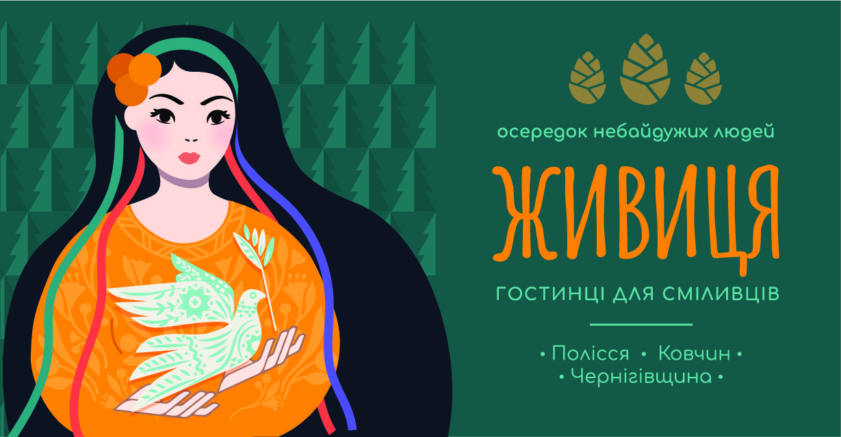
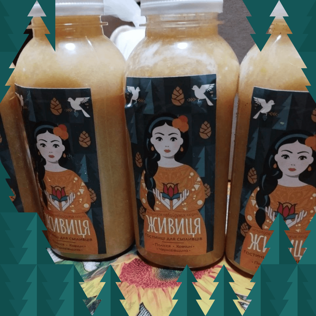
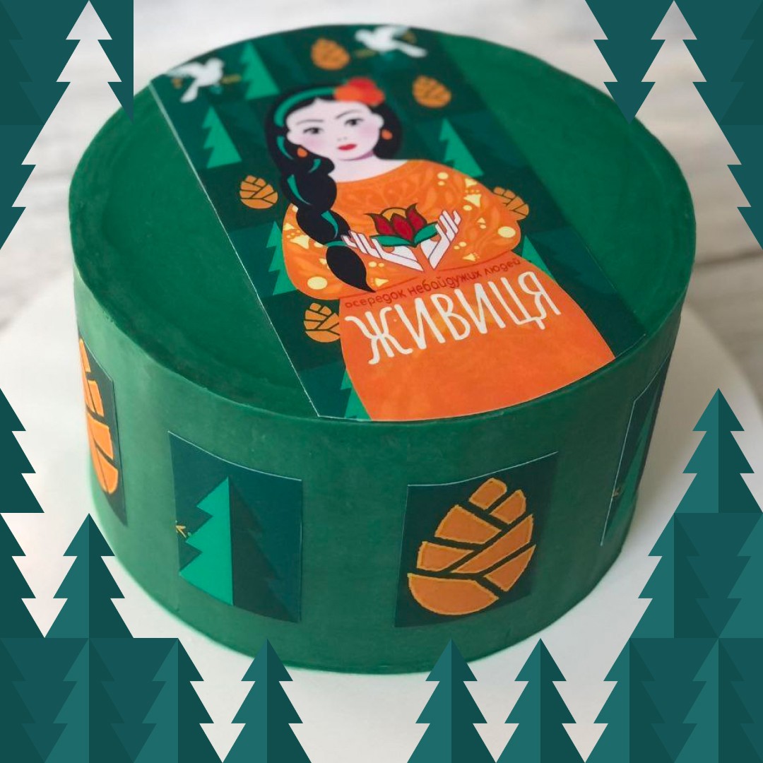
We chose the image of a Polissya woman with ethnic motifs as the basis for the design. We decided to use an attractive bright color scheme.
Naming and logo
We called ourselves Zhyvytsia because we wanted our name to have something Polissya in it — a greeting from our region. And there are many pine forests and oleoresin (ukr. 'zhyvytsia'), which heals wounds and cures. We have decided that our land and our people will heal wounds. And our Zhyvytsia will work for as long as it takes.
Logo
Slogans that reflect our essence and identity
Bright is glad to join the community of caring people
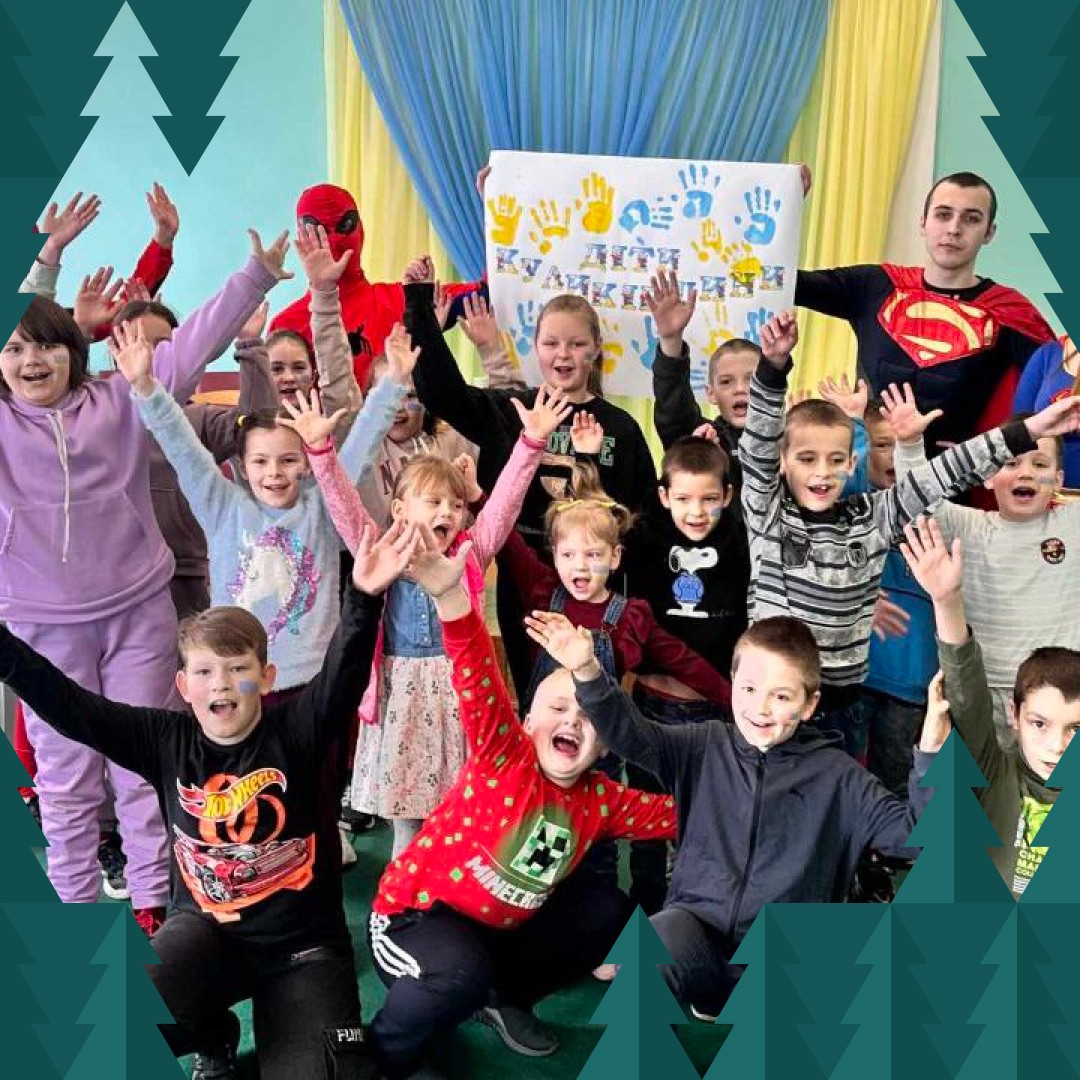
who work devotedly in two directions - humanitarian aid to the military and support for children who need additional attention