We are strategy, creative & digital

We are strategy, creative & digital

We are strategy, creative & digital

Visual and verbal identity for a dental clinic

Hello Dent!
Because teeth also have feelings

UIUX

REDESIGN

Image

The context

The business has been operating since 2008. The founder is a head dentist with extensive experience and high trust from her patients. After gathering a professional team that shares her values and approach to business, she decided to launch a new brand and slightly change the business model. Now it is a dental clinic with its own staff that fully manages all processes for it — from product and equipment to promotions and ensuring patient flow.
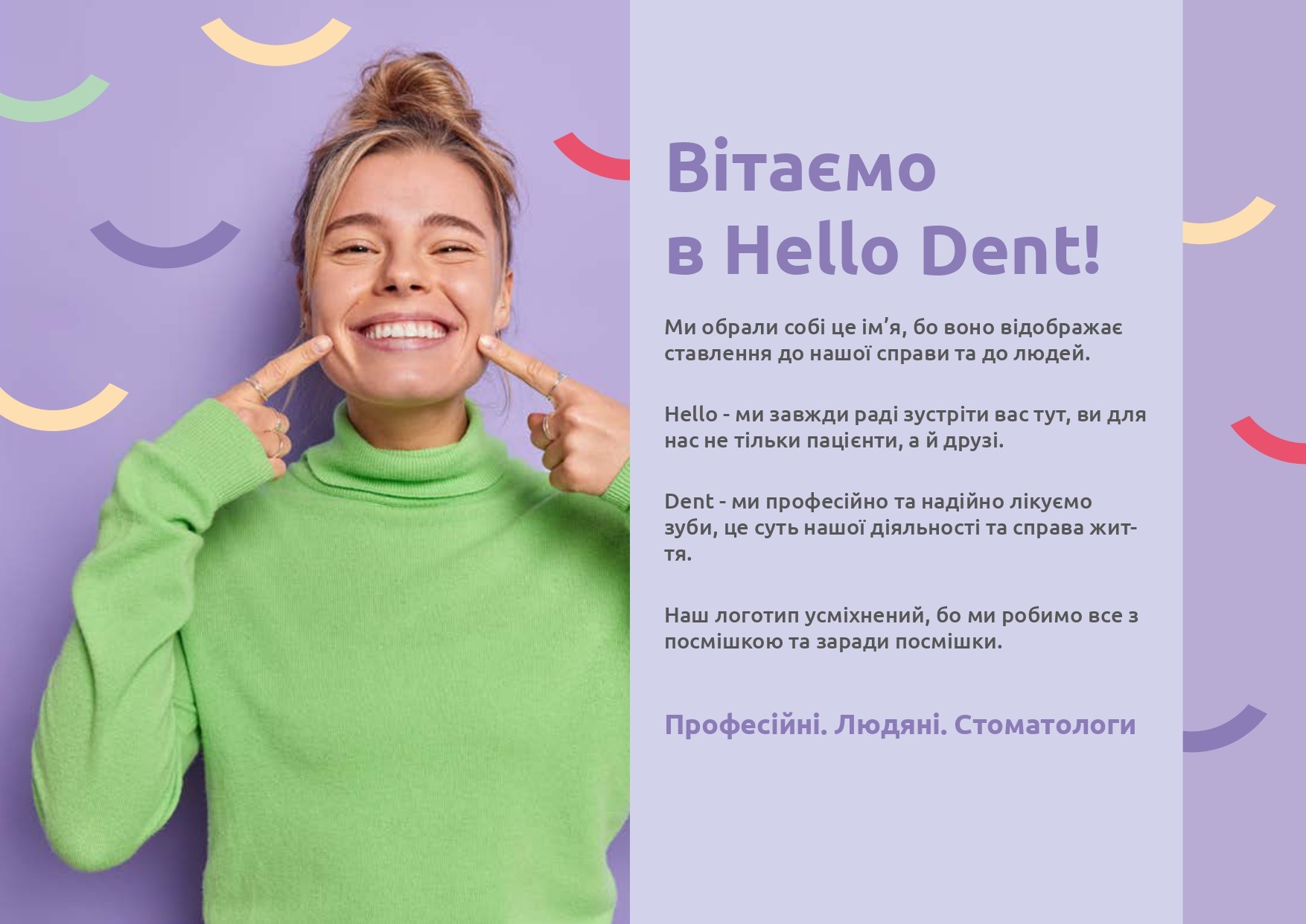
What is Hello Dent? A team of experienced dentists, who love what they do and are proud of their patients' trust. They treat teeth professionally, reliably and with guarantees. They are attentive doctors who know how to calm down and create a comfortable and relaxing atmosphere for their patients.
Values: uncompromising professionalism and genuine humanity.

What tasks we have been solving

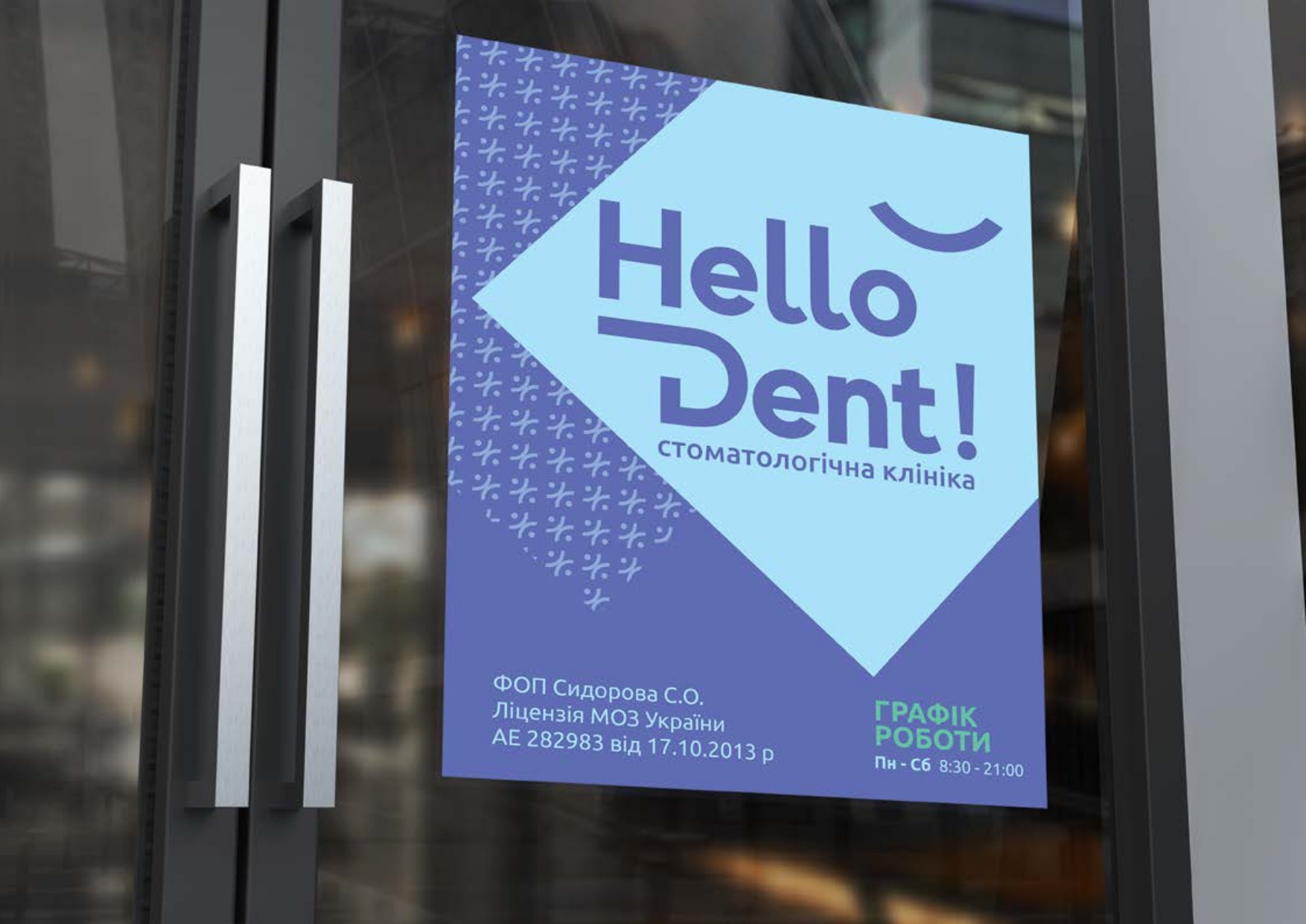
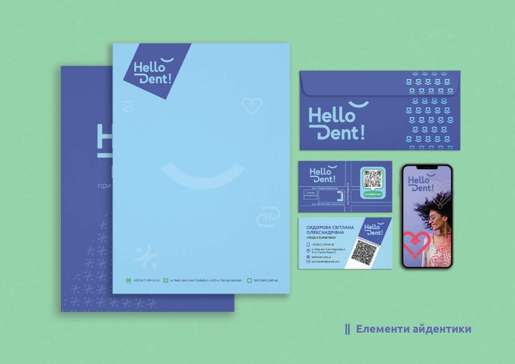
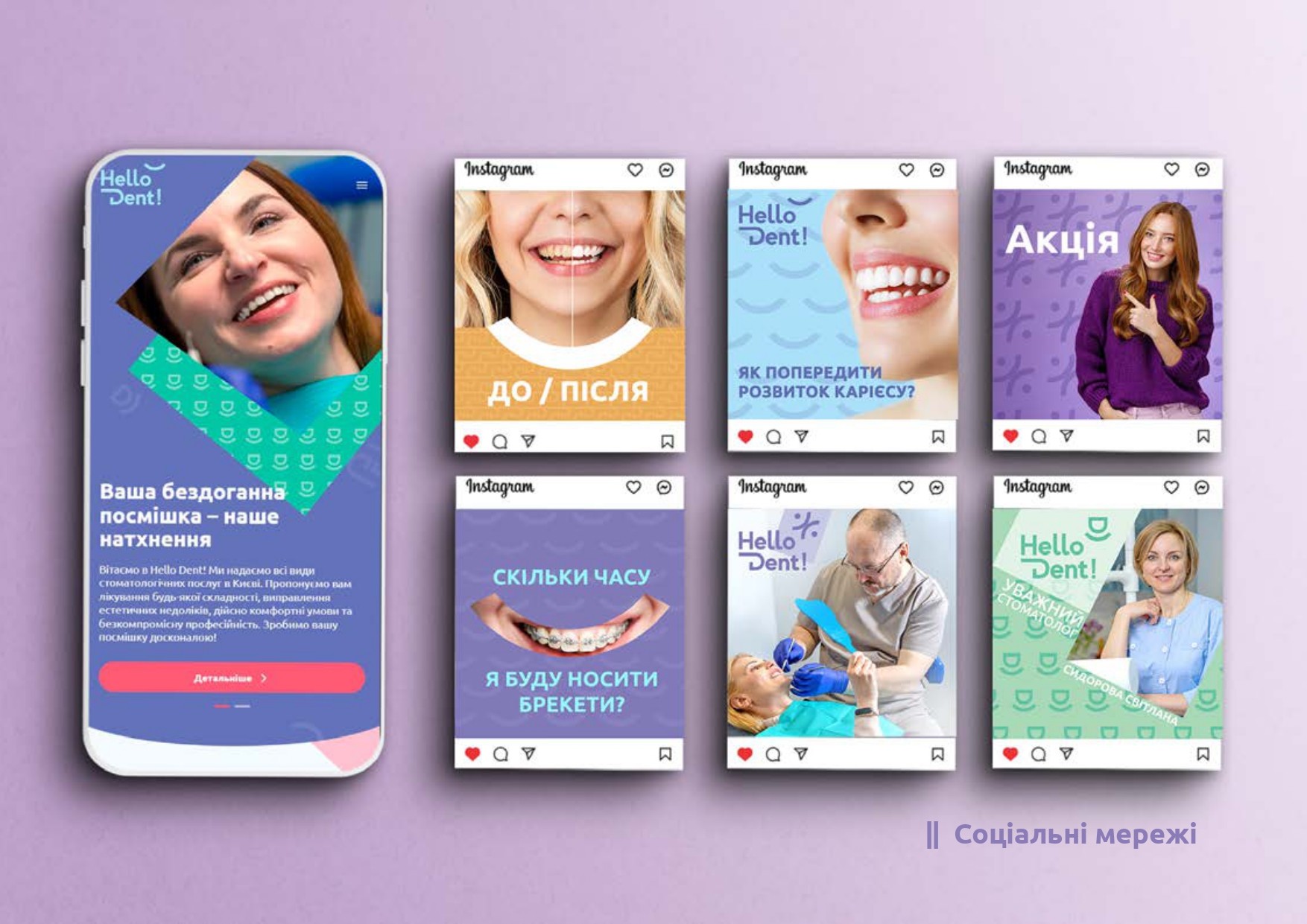
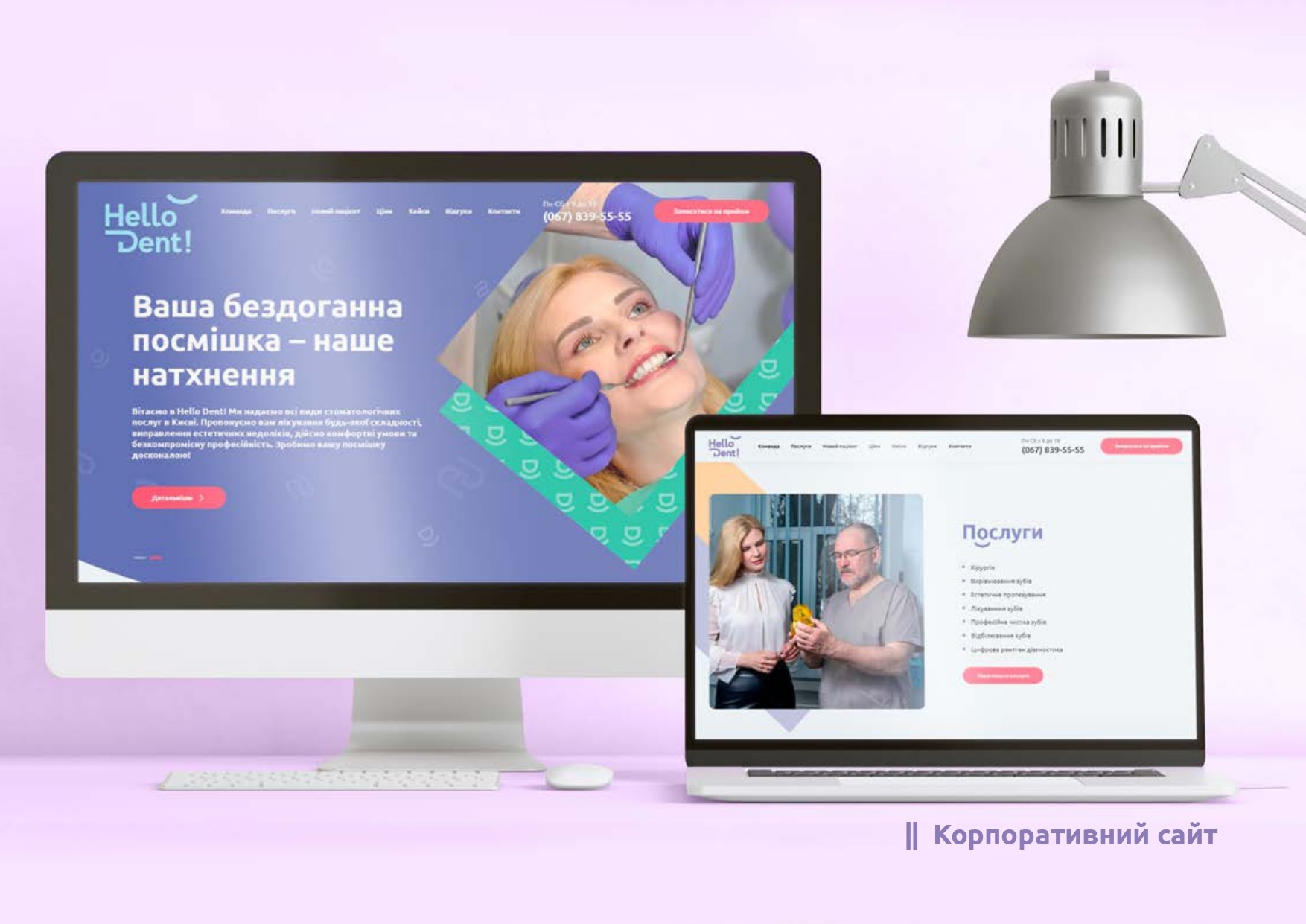
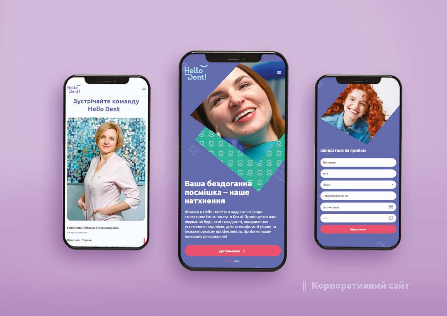
We had to create an identity for the new brand that would reflect its ideas and meanings. It had to be visible, unique, and stand out from the competition. It had to look good and be easily adaptable both online and in the real world.

Our approach

We saw it as something that would give a sense of professionalism and reliability without being boring and sterile. It had to be emotional, memorable and attractive. It had to be elegant and, at the same time, expressive and charismatic. And of course, friendly and welcoming.

Image

Smiling Hello Dent logo!

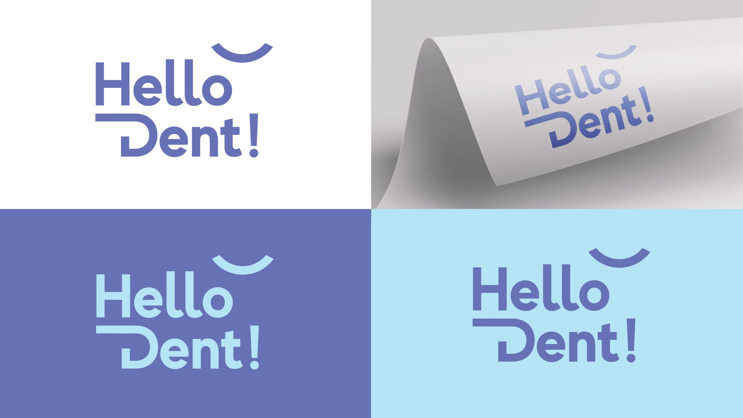
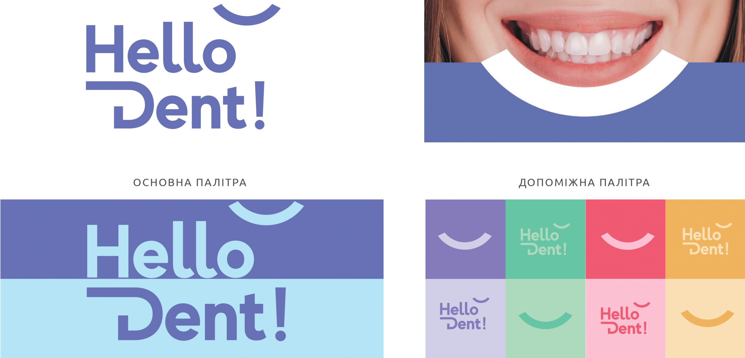
The logo reflects the core idea and values of the brand. The word "Dent" identifies the clinic as a professional dentist. The word "Hello" and a smile reflect the careful approach to clients. The logo consists of two parts: a unique graphic font and a sign symbolizing a smile. Together they form a new identifying symbol of the company.

The Hello Dent logo! Structured, rhythmic, balanced, easy to remember and recognize.

Image
Image

Graphic images

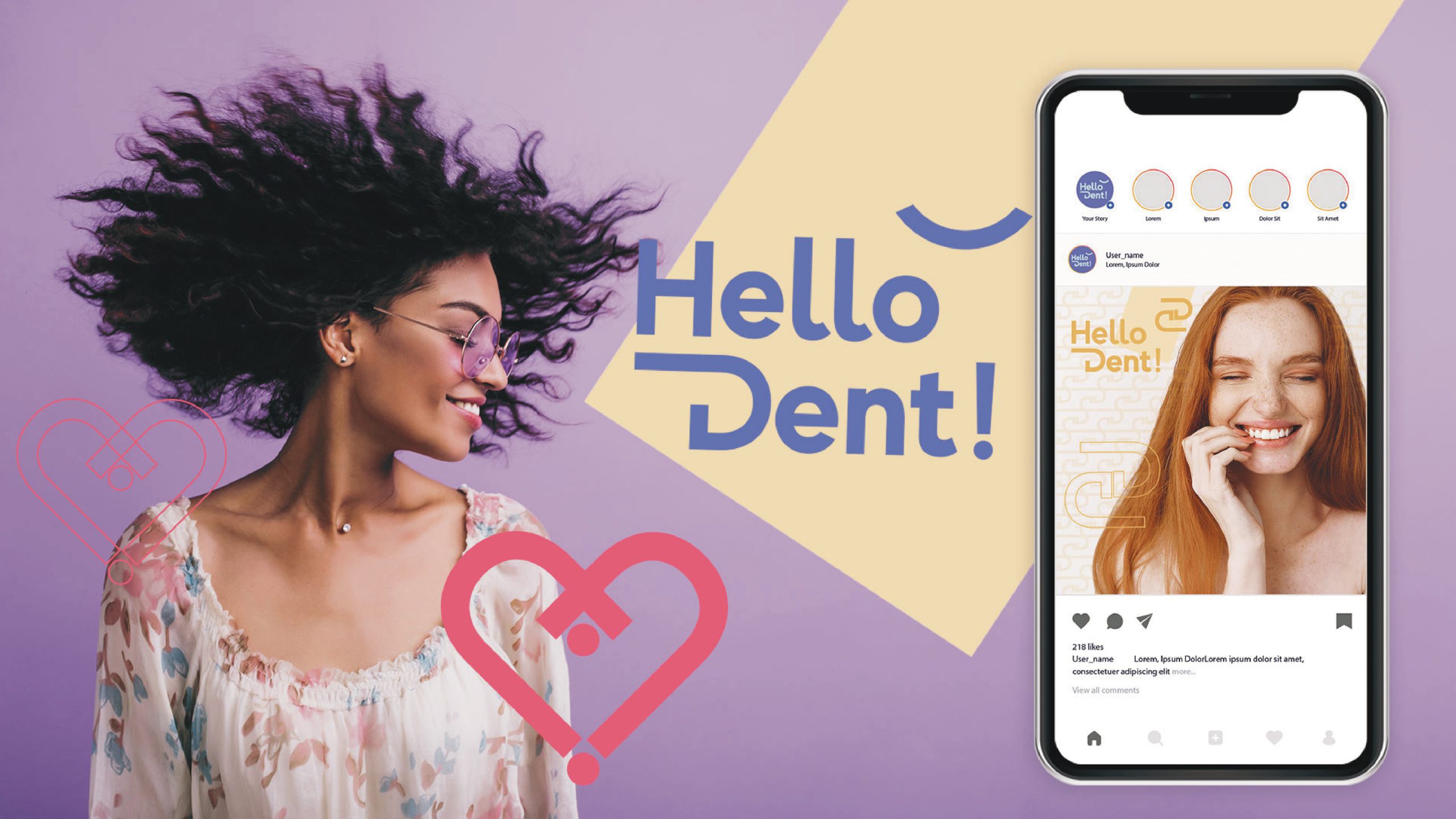
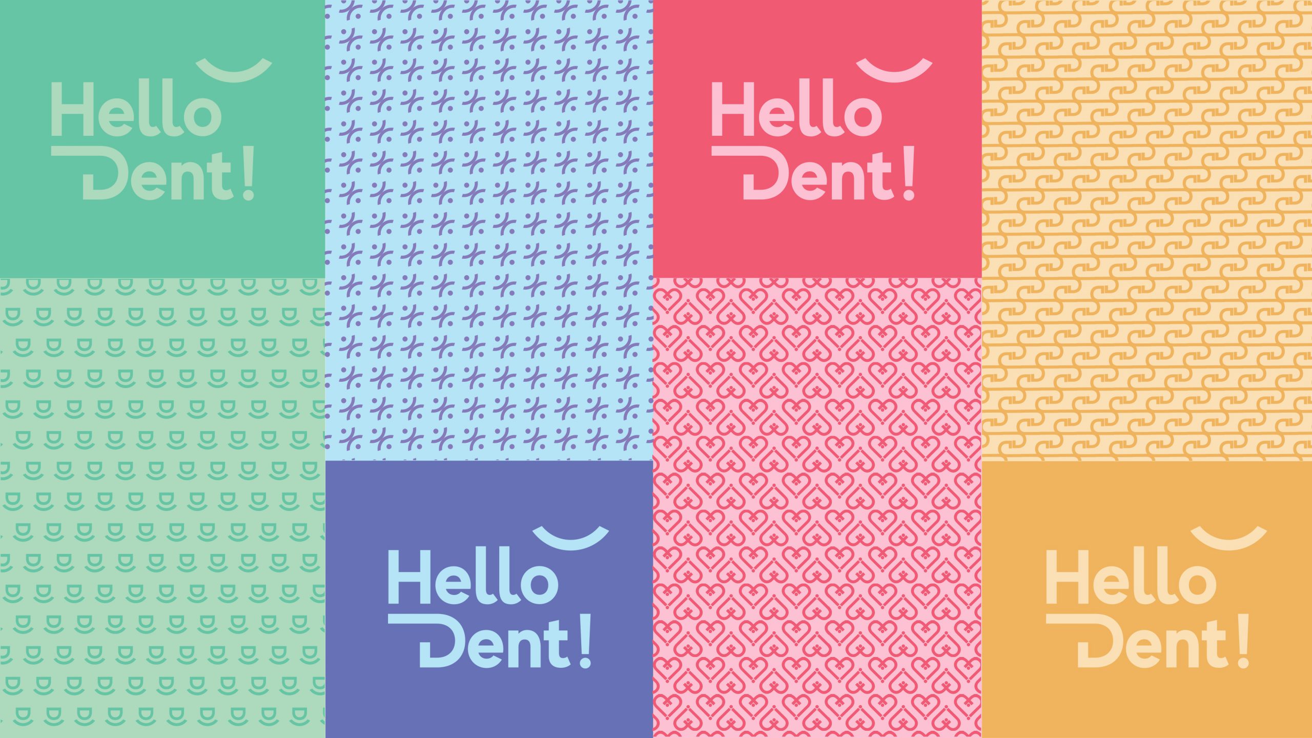
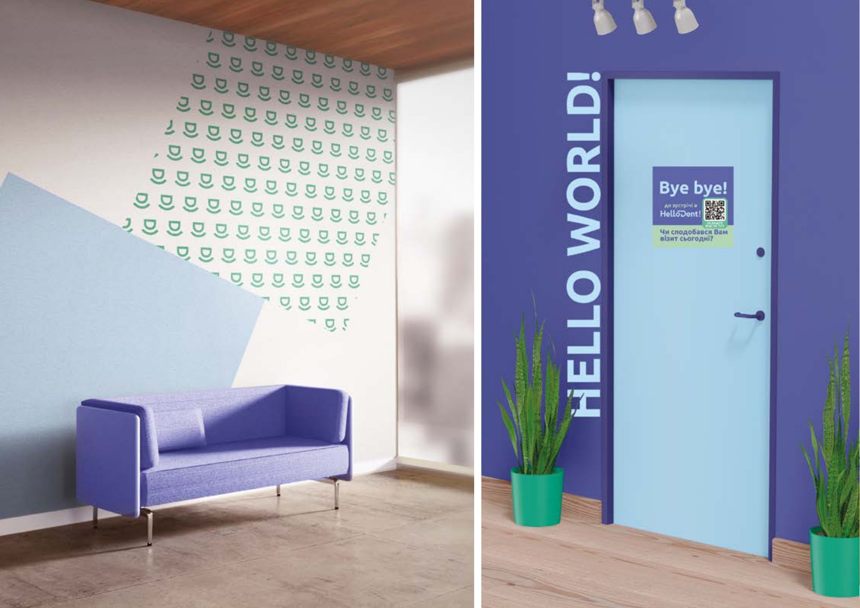
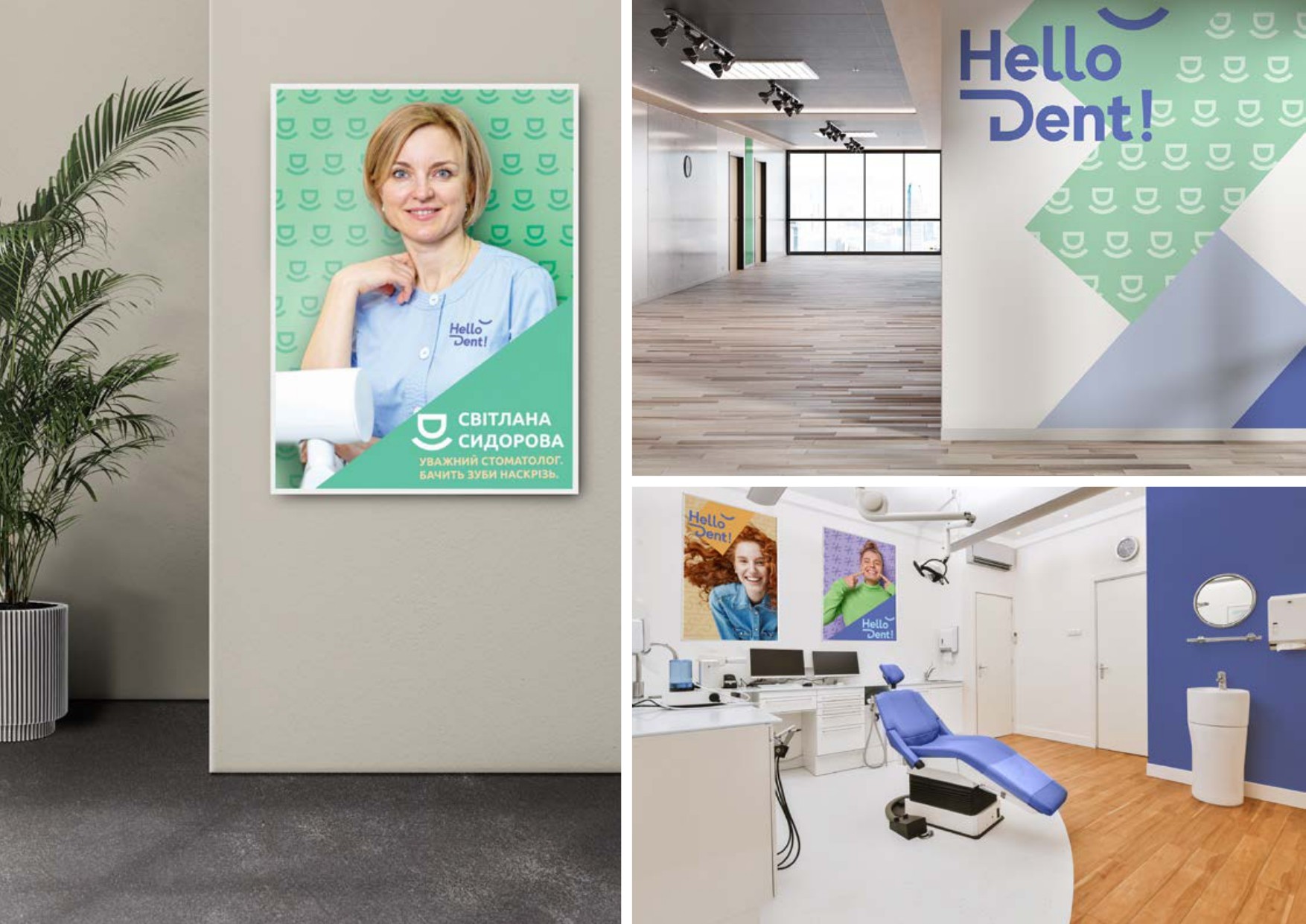
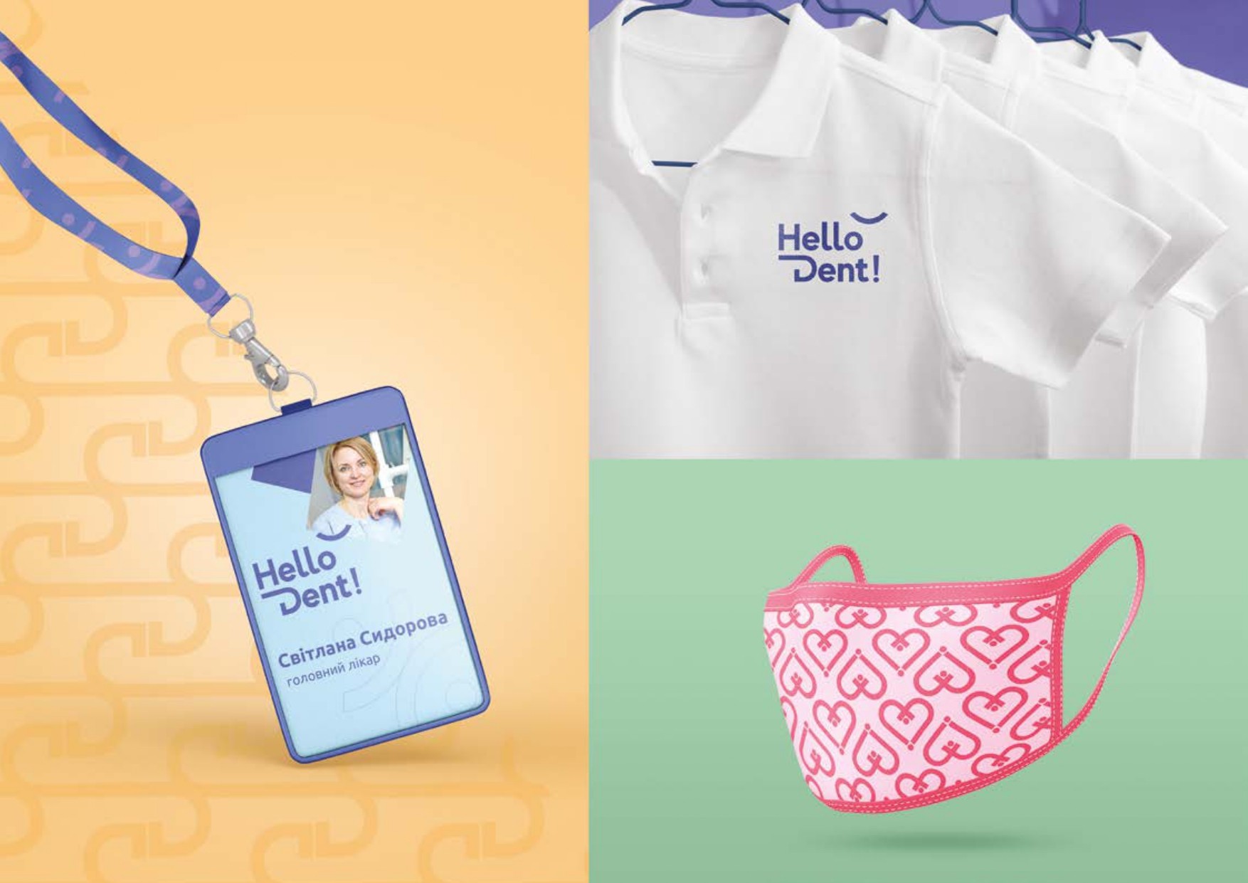
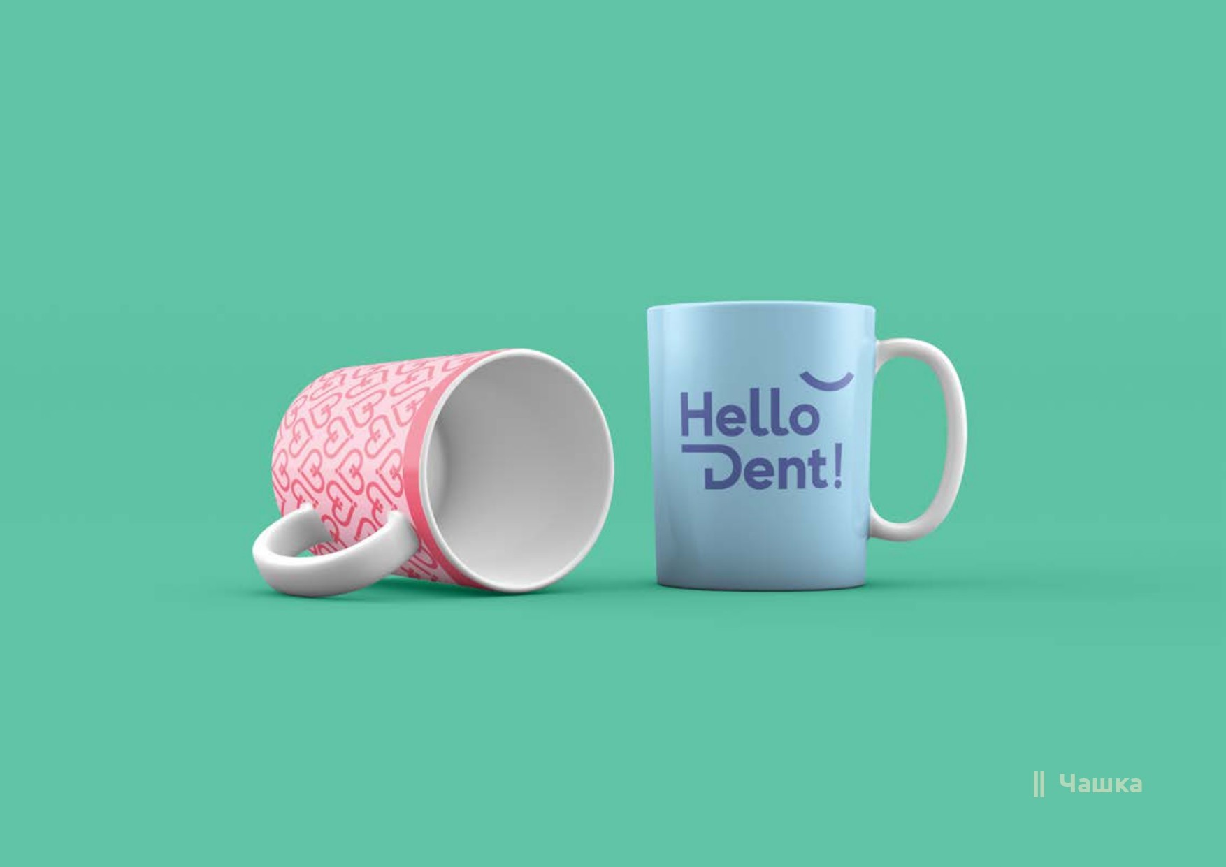
A dynamic visual identity is variable and adaptive. For example, the logo can change brand symbols or colors, and graphic elements can be adapted to the desired layout. Graphic symbols are ideal for reflecting key brand values. These are the doctors' expertise, reliability, mutual respect and the clinic's care for its patients. Based on the developed unique symbols, we created brand patterns. These patterns make the image of the clinic lively, deep and warm. They can be used in addition to a photo or separately.

We have chosen purple and blue as the main colors. Purple is the color of balance, harmony and calm. Blue — evokes a sense of security and trust.

Image
Image

Corporate fonts

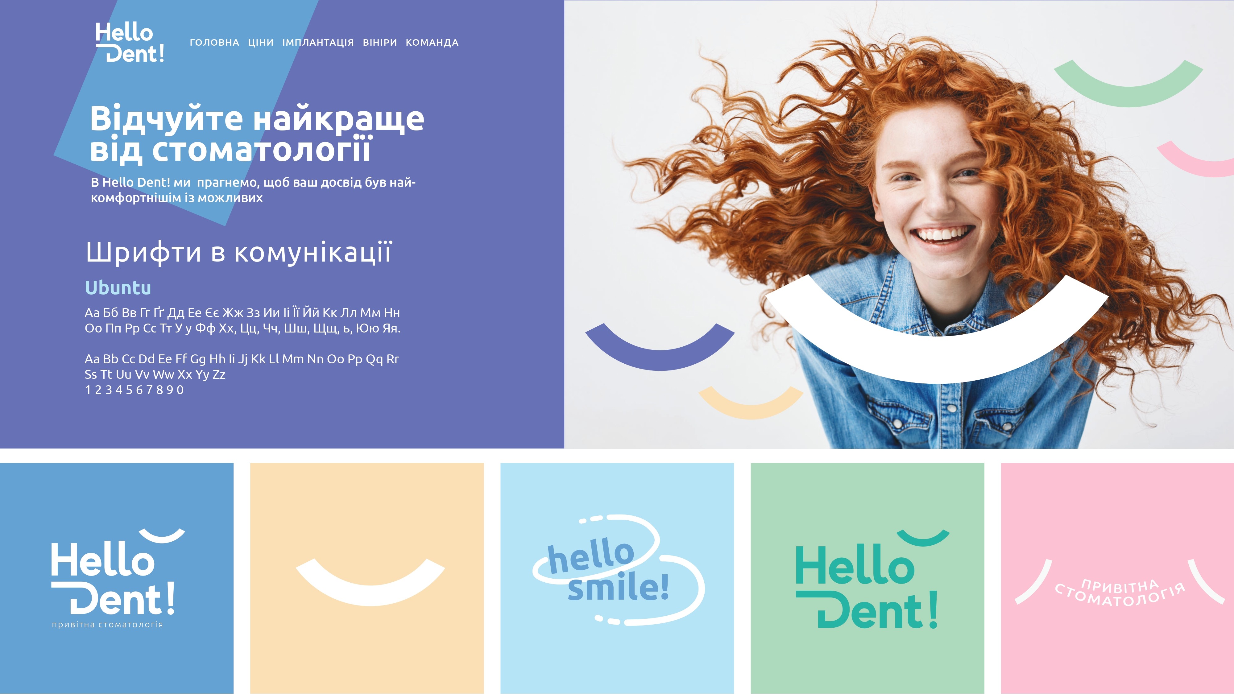
A typeface is essential to communication and allows us to express the essence of a brand in the clearest and most clear way possible. Ubuntu was chosen as the main brand font because it best reflects our friendly nature and accessibility. The Ubuntu typeface is open and easy to read, friendly and modern.

Image
Image
Image
Image
Image
Image
Image
Image
Image
Image

So, Bright has developed an identity that:

Reflects the brand's positioning and values. Visible, unique and stands out from the competitors. Easy to integrate, evolve in offline and digital.

Our client received:

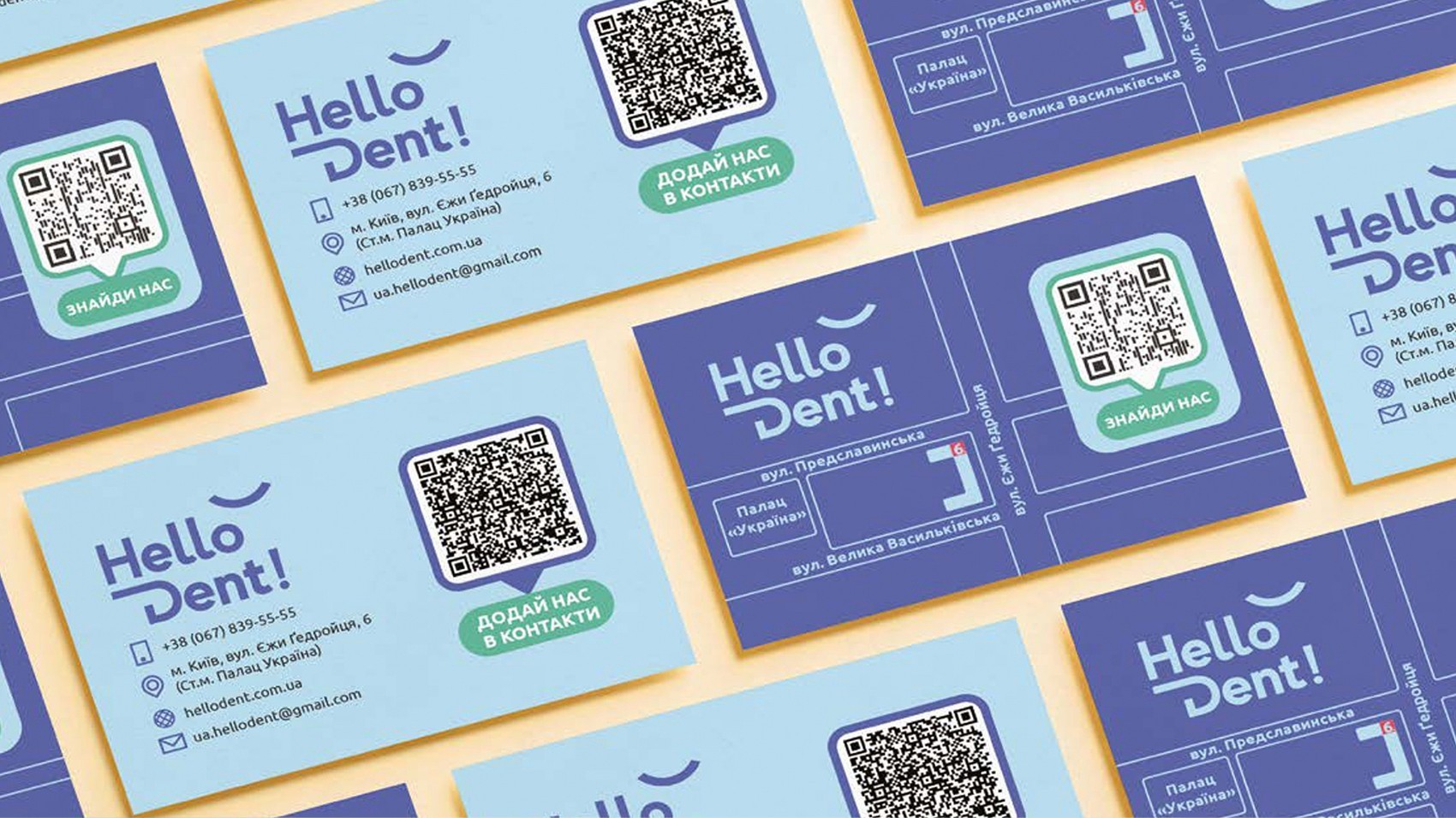
a well-organized brand book, all source versions and original layouts of new materials. The next step of the partnership is Hello Dent!'s growth strategy, so what follows is...

crossmenu