We are strategy, creative & digital

We are strategy, creative & digital

We are strategy, creative & digital

IT company's visual and verbal identity

Eigenmethod
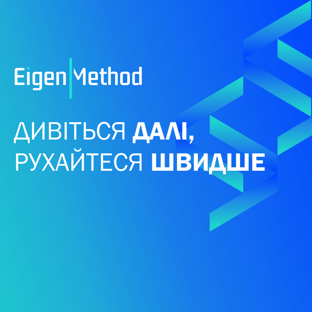
Look beyond, move faster

IDENTITY

DESIGN

Image

The context

Eigenmethod is an expert in the implementation of business systems based on SAP. Today, Eigenmethod has 3 representative offices and is a partner of SAP in Ukraine, the leading enterprise software company. Business management support is the main value of Eigenmethod's products and specialists. Target audience: top management of large or medium-sized companies.

What tasks we have been solving

With technology at the heart of the business, the future branding needed to leave the impression of a strong, technological, intelligent and expert brand. At the same time, it should look modern and digital.

Our approach

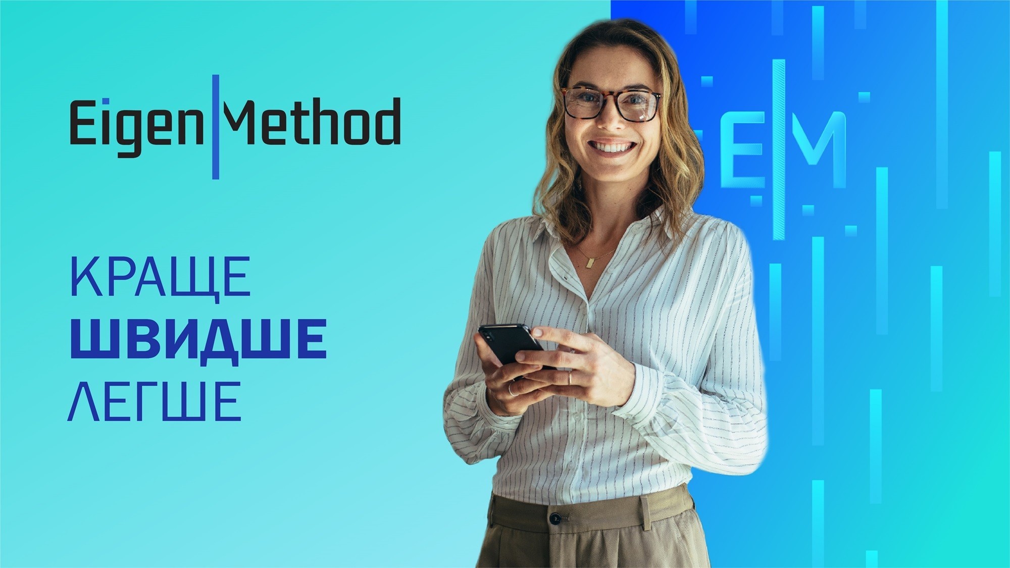
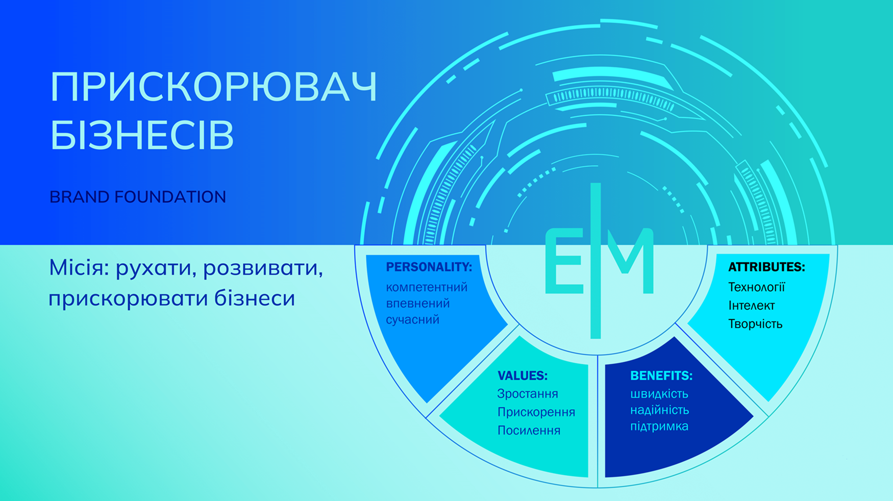
We came up with two stylistically different conceptions, then did a selection and refined it. Our client chose the 'Accelerator' concept.

Image

Logo and branding elements

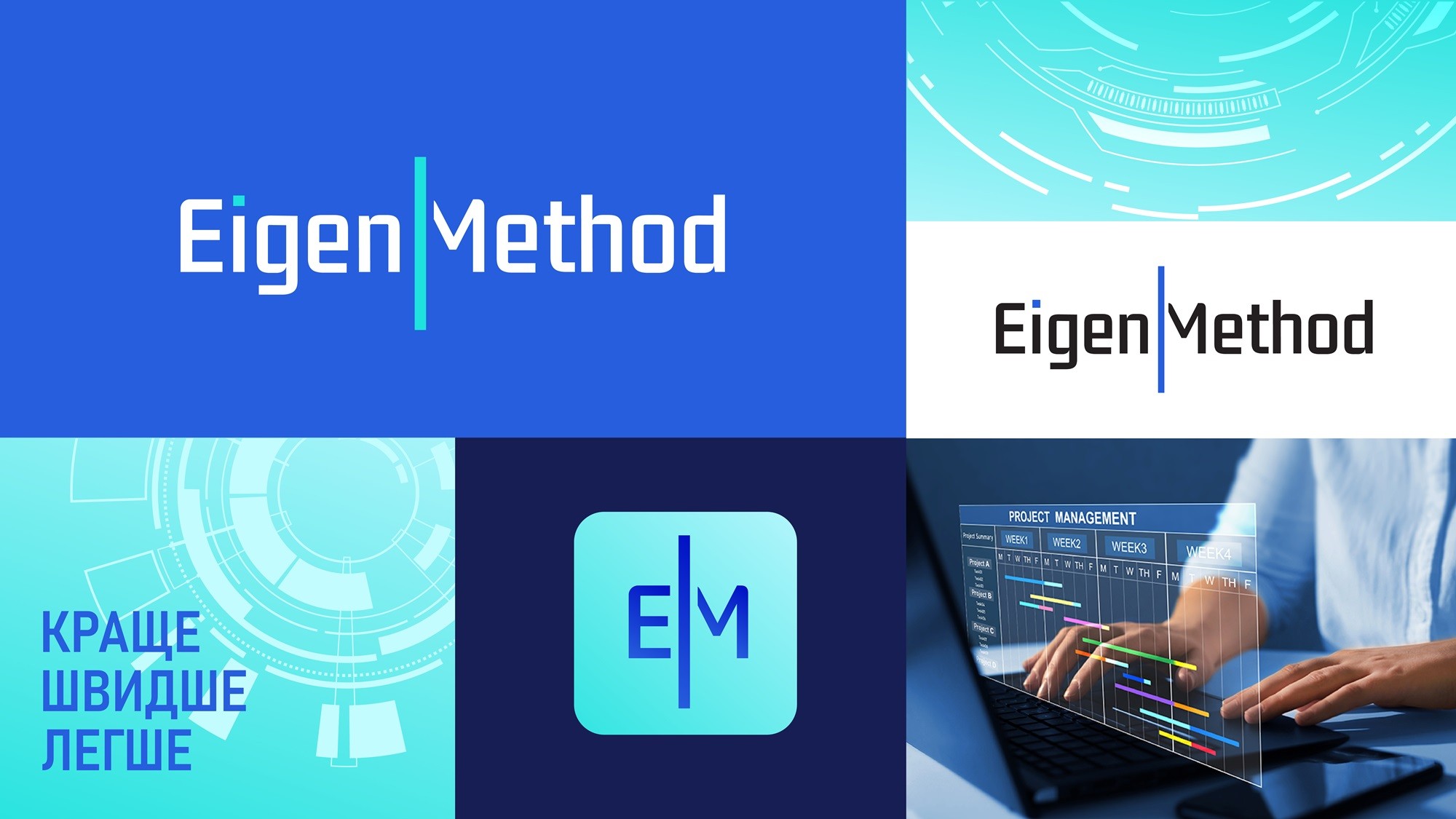
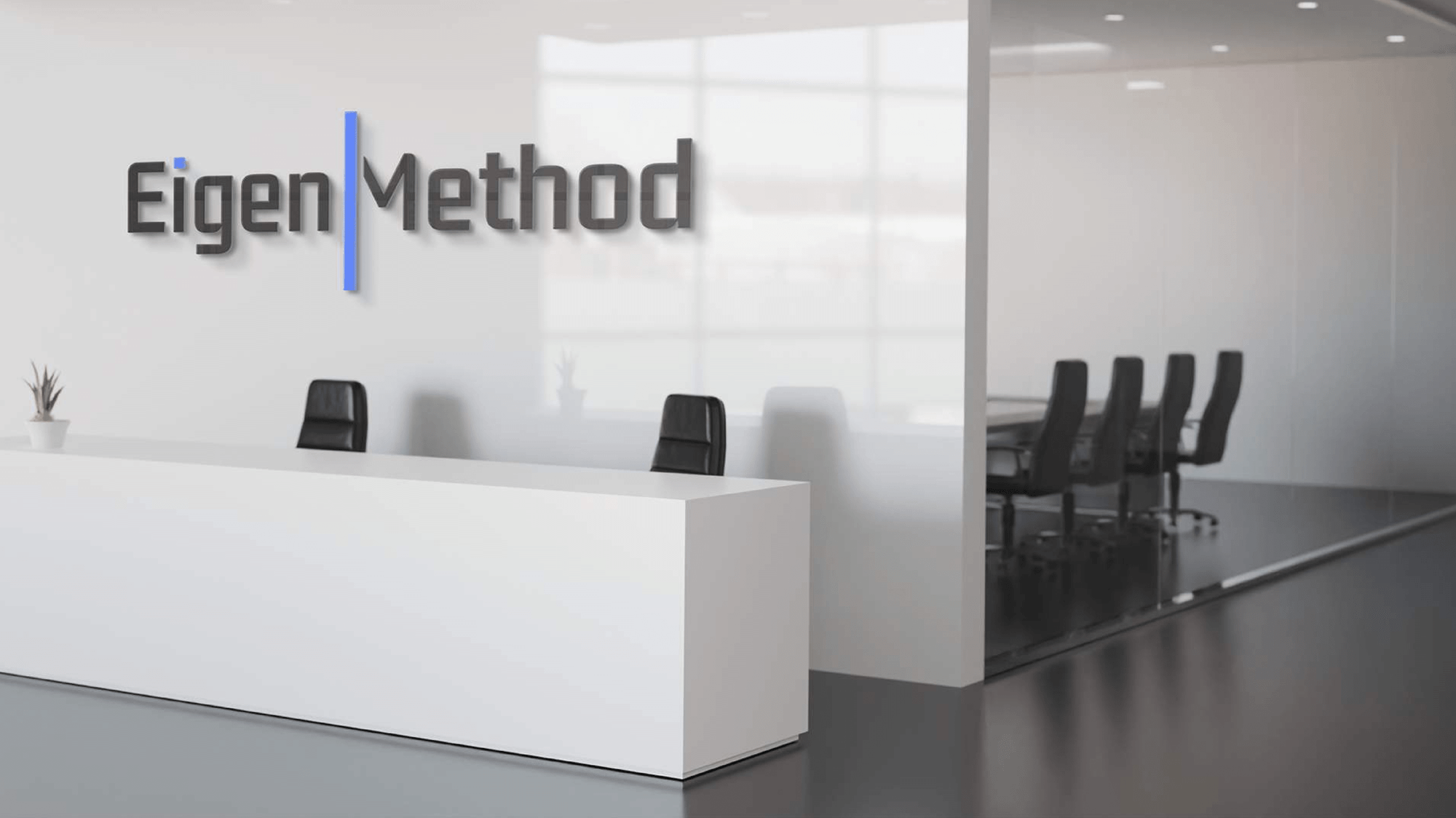
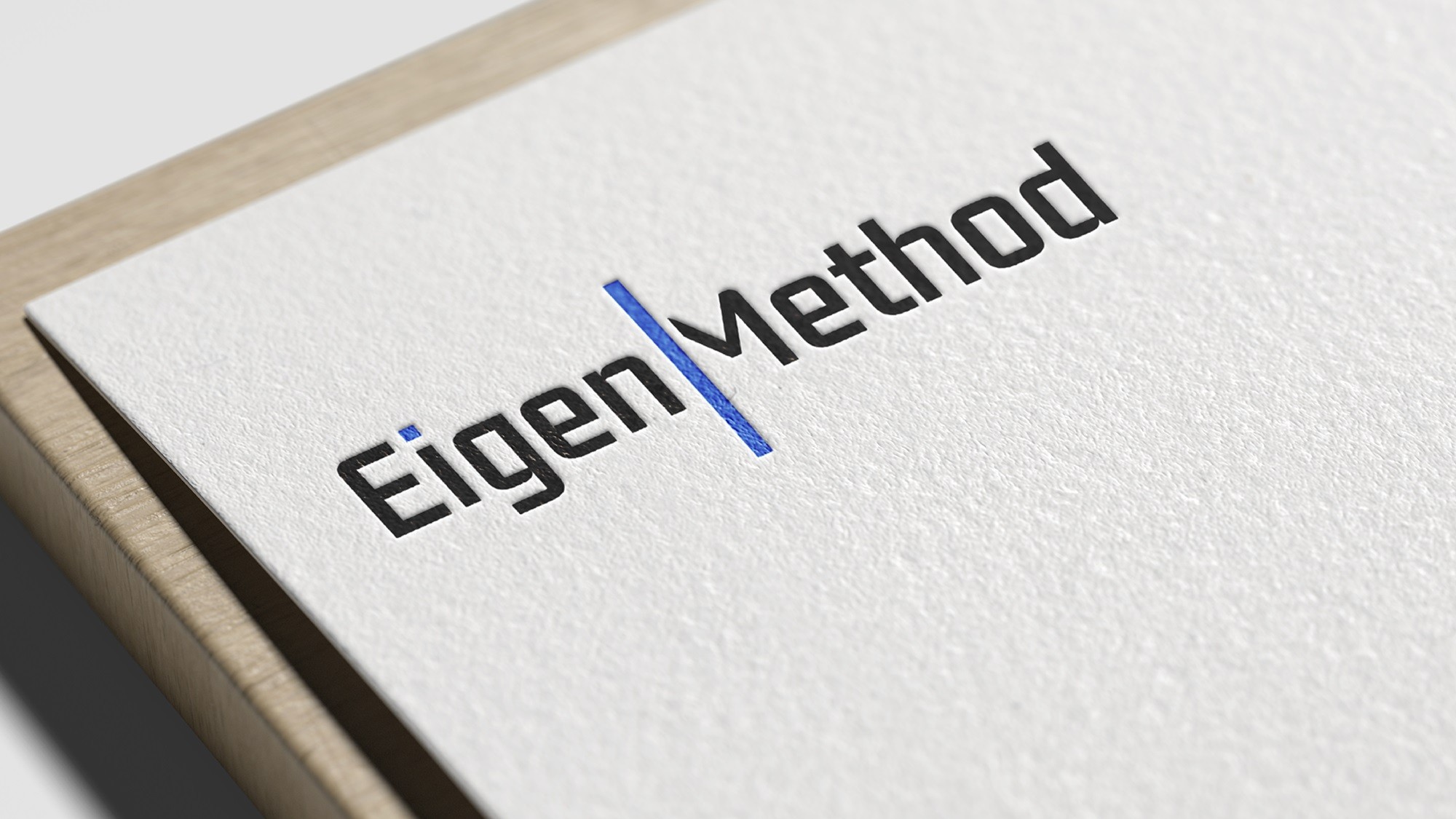
The brand logo reflects the idea that Eigenmethod's business is a world of technology and creativity. The focus is placed on the cursor, which defines and guides the business in the world of technology. It bridges the gap between technicity and creativity. The brand's mission is to accelerate business, so the cursor becomes a high-speed indicator of direction. Our logo is a symbol of how the company keeps up with the rhythm of the modern world and helps other businesses move faster.

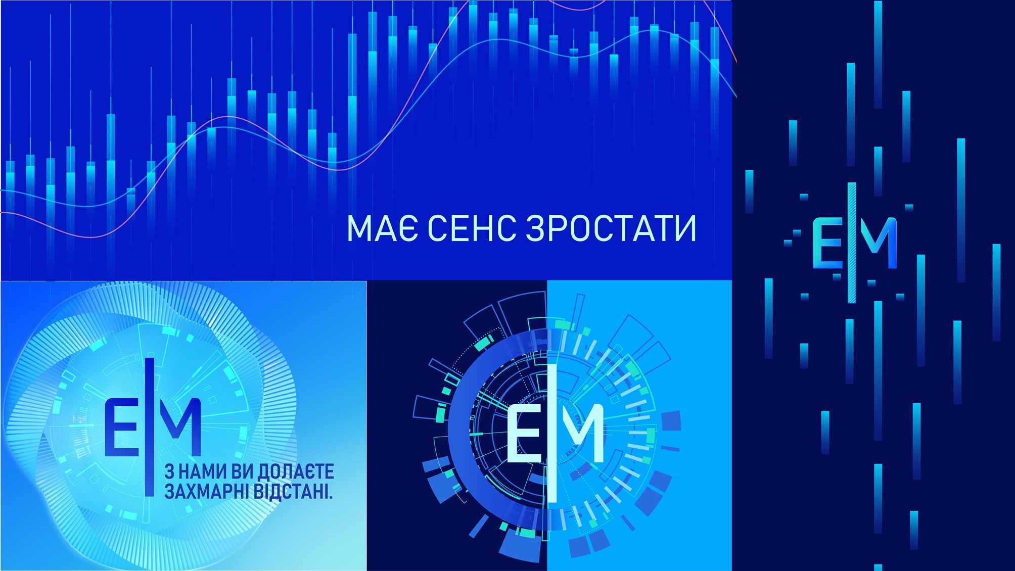
Visuals and symbols that reflect our key concepts.

Image
Image

Corporate fonts and colors

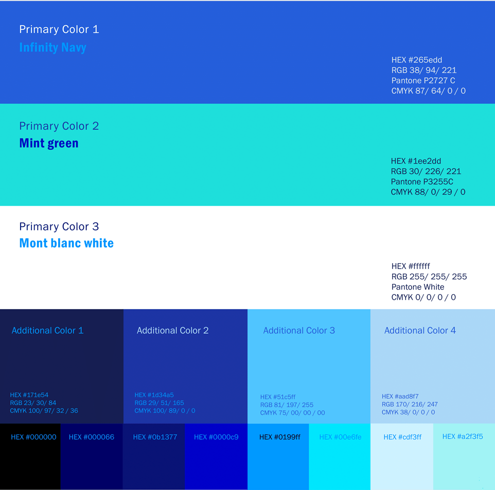
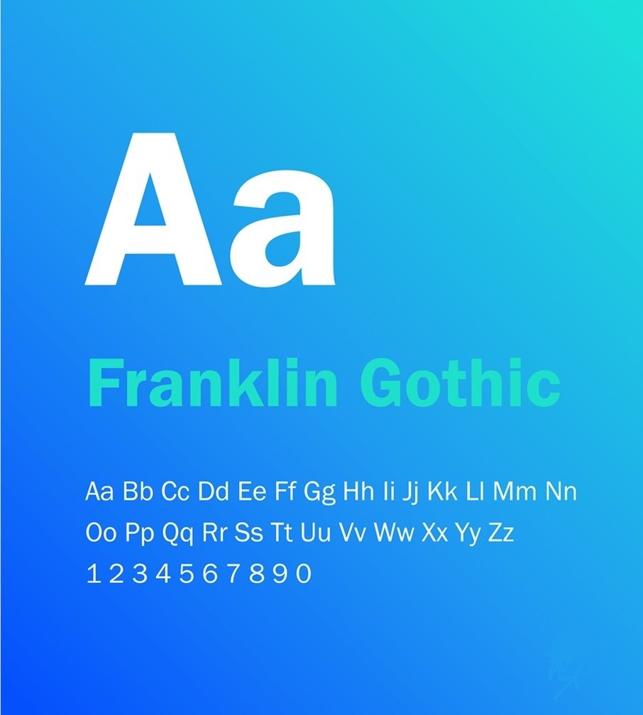
Franklin Gothic is a multipurpose font that is used as the main typeface in our branding. Its simplicity, style and versatility make it an ideal choice. The typeface is known for its modernity and strength, which provides powerful visual appeal. Its localised geometric shapes give the brand confidence and reliability, reflecting expertise. The color palette is both restrained and modern is ideal for technology business. Blue causes a sense of trust and reliability; exactly what customers are looking for in a technology partner. The white color supports the concept of simplicity and accessibility, while the mint empasis creates a favorable atmosphere.

The combination of these colors influences the perception of the company as professional, friendly and reliable, which is important for the IT industry.

Image
Image

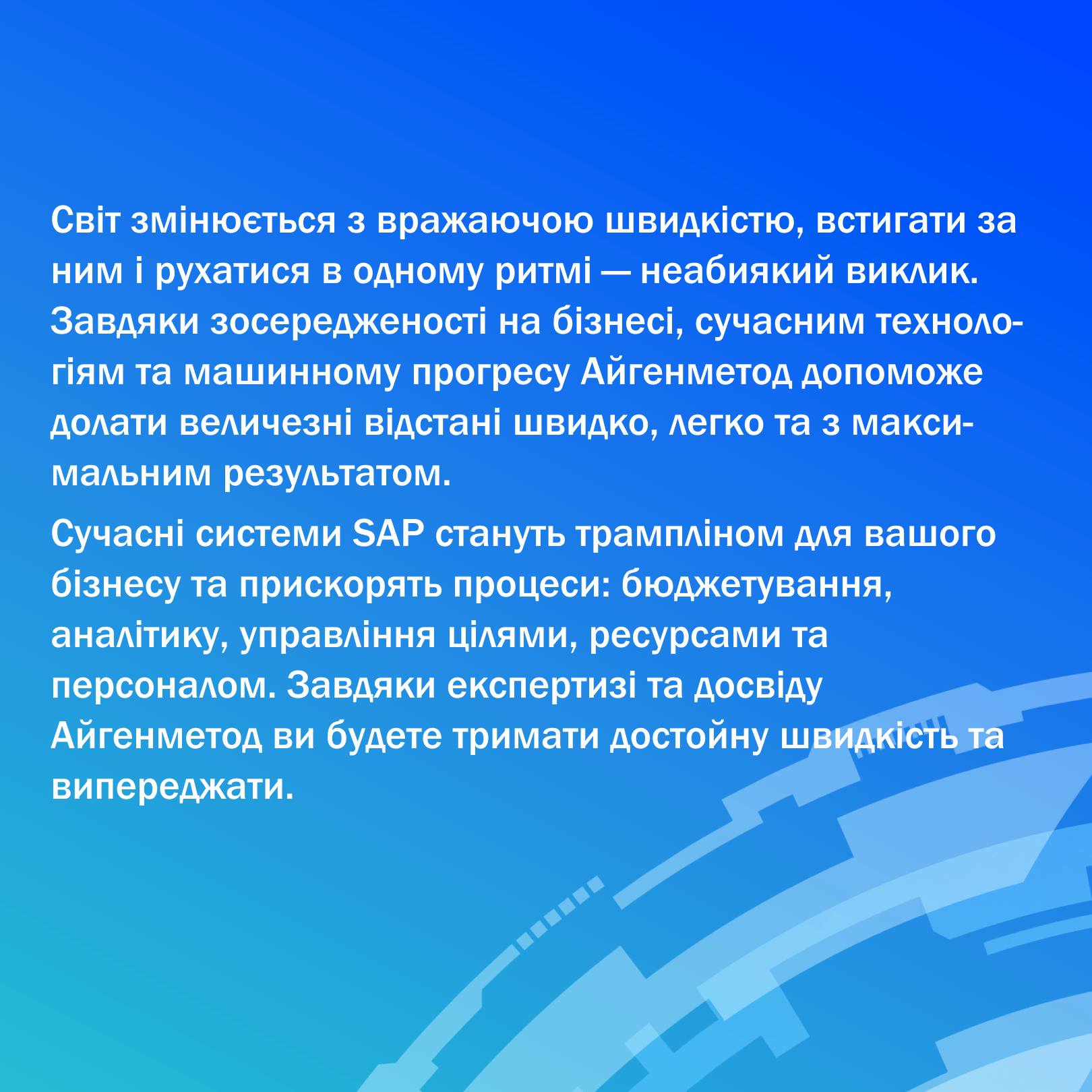
Eigenmethod's manifesto and main slogan

Image
Image

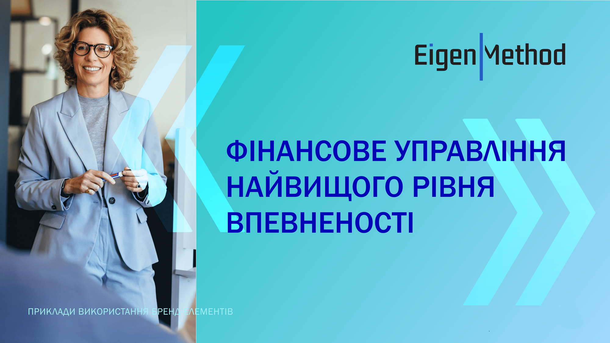
Advertising materials and creatives

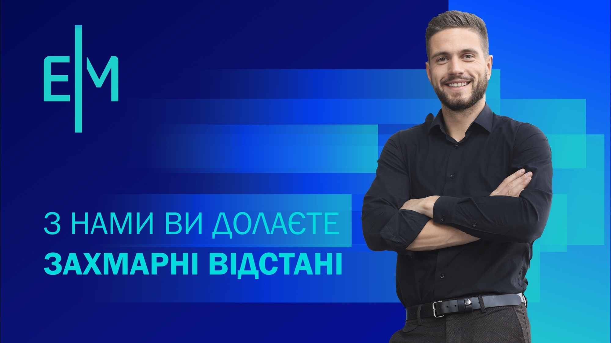
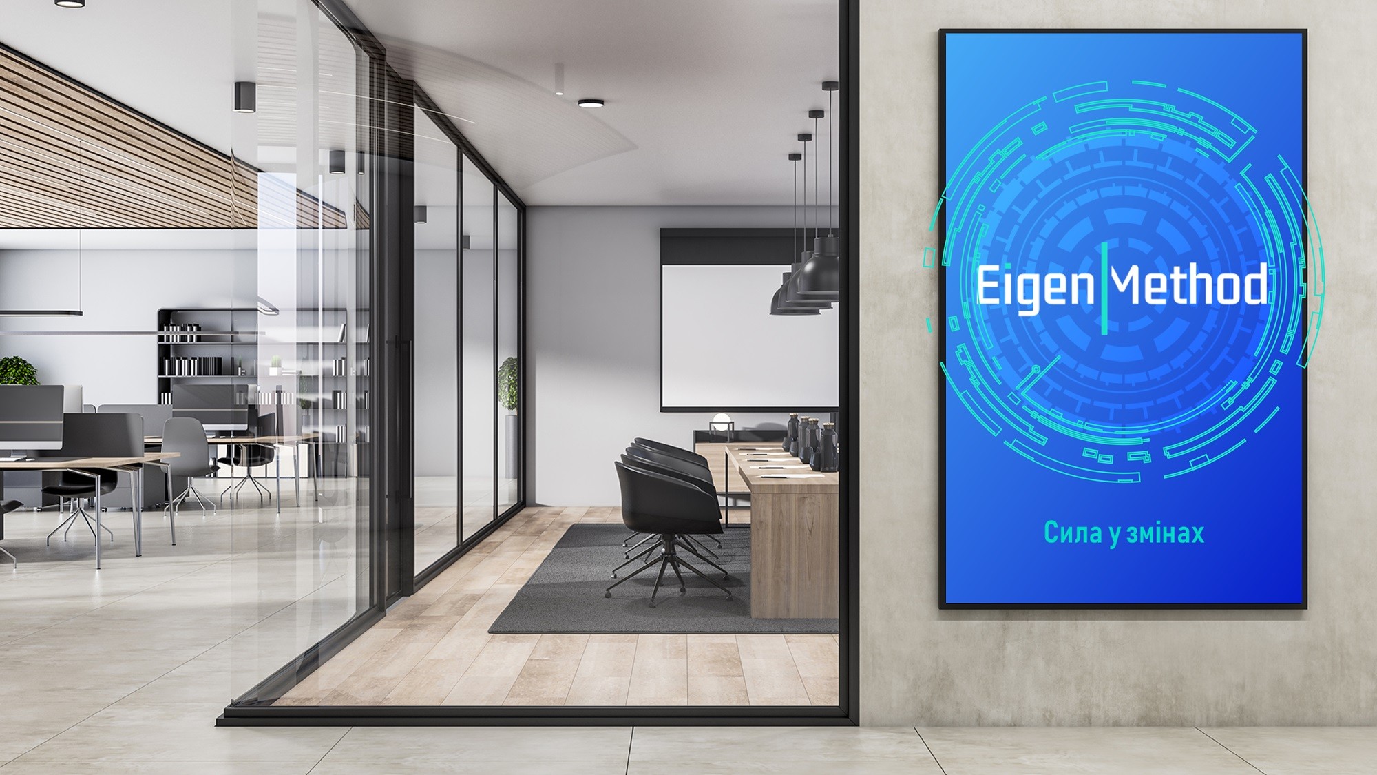
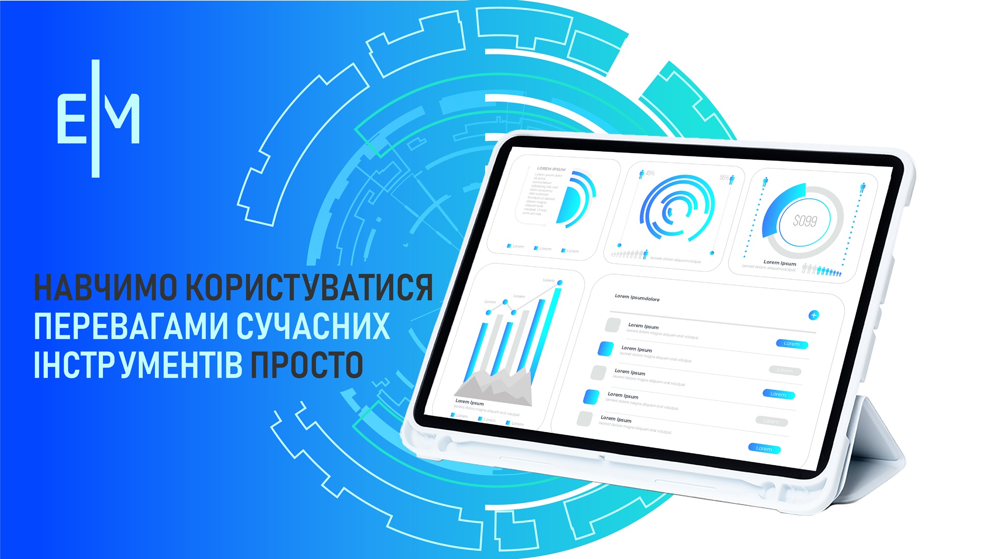
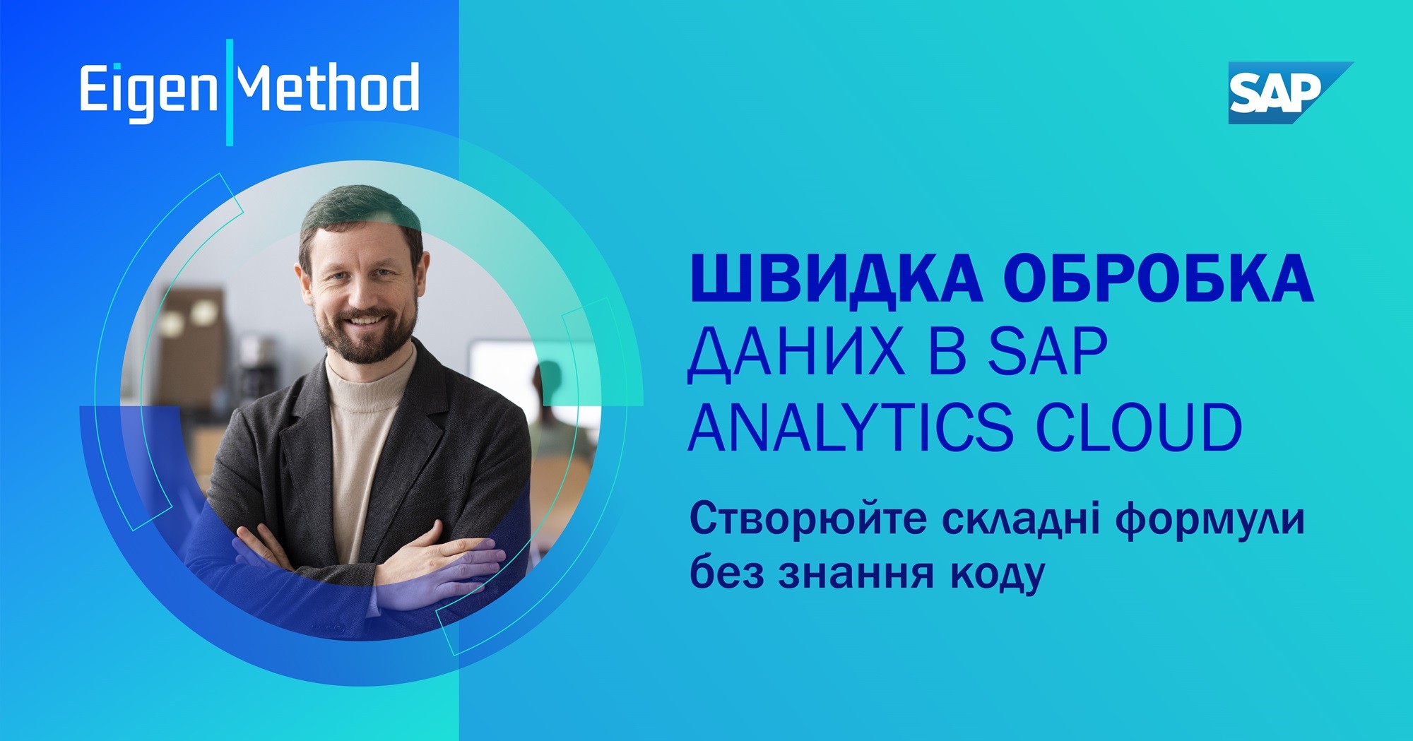
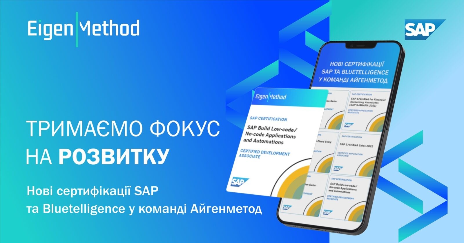
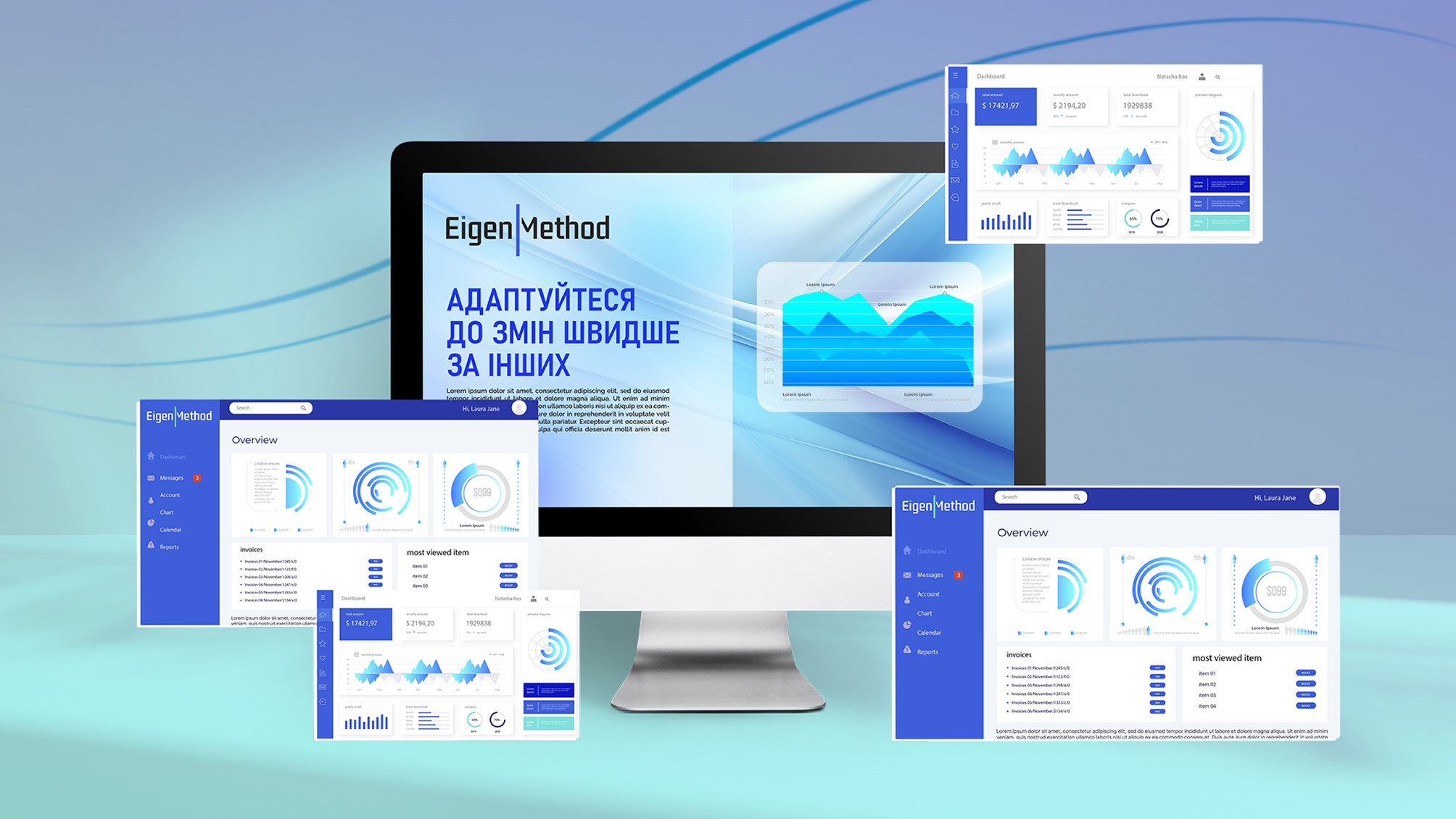
Brand backgrounds, mood boards, image materials, advertising banners for social media, educational and presentation materials bring the core values of Eigenmethod.

Image
Image
Image
Image
Image
Image
Image
Image
Image
Image

So, Bright has created for Eigenmethod

a new logo, colors, fonts, brand elements, image and infographic styling, and creative style; slogans, brand manifesto, tone of voice, lexical field. The materials are organized into a brand book that describes all the key aspects of the Eigenmethod brand: concept and values, tone of voice, lexical field and slogans, visual identity.

Our partner has received

all source versions and original layouts: logo in all versions and formats, selected fonts, brand elements and brand backgrounds, layouts of advertising and image materials, extended version of tone of voice. 60 slide templates for presentation materials, including templates for charts, graphs and dashboards.

crossmenu